
When you log into DataGroomr, you land on the Reporting Dashboard — a single, customizable home page for monitoring the quality of the Salesforce data managed by DataGroomr and for drilling into individual Salesforce objects. This article describes the layout of the dashboard, the object detail view, and how to add and configure widgets.

Sidebar Navigation
A persistent sidebar lets you move between the dashboard and any Salesforce object without losing context. The sidebar lists the Dashboard entry followed by every Salesforce object added to DataGroomr, each with its current record count. Cross-object datasets, if present, are listed below the standard objects.
Global Health KPI Bar
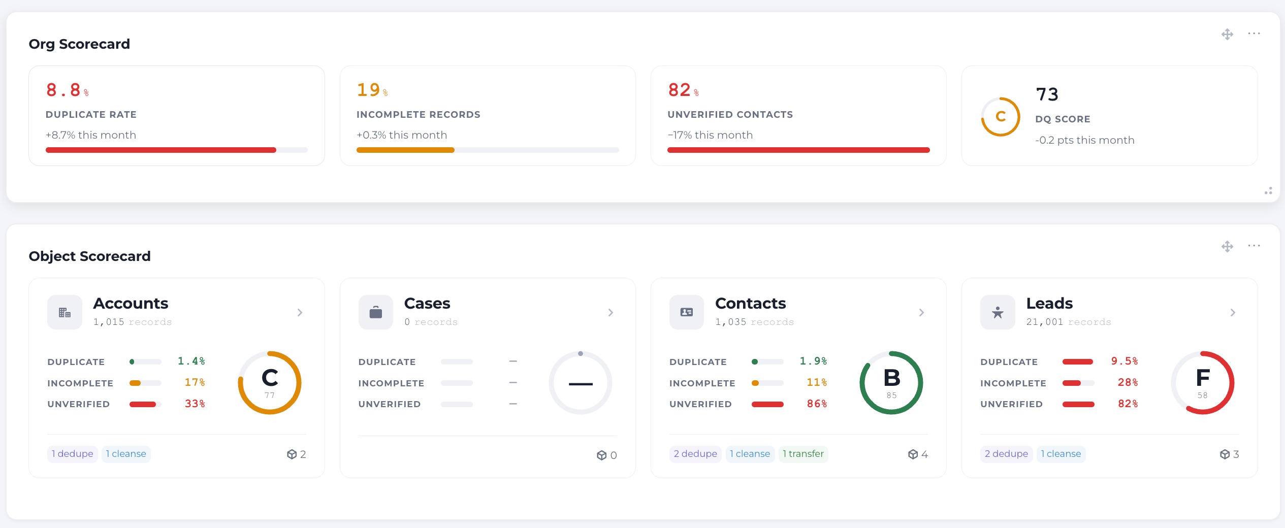
The top of the dashboard shows four KPI cards that summarize your most important data quality problems so you can decide what needs attention before drilling in. The first three cards surface problems — a higher number means a worse result — and the fourth is the composite DQ Score rolled up from all of your data quality models.
- Duplicate Rate
- Incomplete Records
- Unverified Contacts
- DQ Score
Each card shows its value, a short label, and a trend delta indicating whether the metric has improved or worsened.
Object Cards Grid
Below the KPI bar, each Salesforce object appears as a card showing its key metrics, the modules active on it, and how many datasets it contains. The grid lets you compare object health at a glance and drill into any object for more detail.
Object Detail: Header and Health Bar
Opening an object shows a header with the object icon, name, record count, and a dataset and module summary, followed by a health bar that breaks the object’s quality into distinct dimensions:
- Duplicate Rate
- Incomplete (completeness)
- Unverified (verification pass rate)
- DQ Score

Pipeline Swimlane Cards
The object view also displays its pipelines as horizontal stage sequences grouped by data segment, so you can see how Dedupe, Assess, Transform, Enrich, and Verify chain together for each segment. Pipelines are grouped automatically by data segment, and each header shows the segment, the pipeline name, its filter criteria, and its schedule.
Customizing the Dashboard
The dashboard is built from widgets that you can add, arrange, and configure to create the home view that suits your team.
Add and Refresh Widgets
Add Widget — clicking the Add Widget button shows the list of DataGroomr components that can be added to the dashboard. A description of each widget can be found in the Widget Components section below.
Refresh — clicking the Refresh button ensures that all views are current, with the latest up-to-date information displayed in each component.
Move, Resize and Customize Widgets
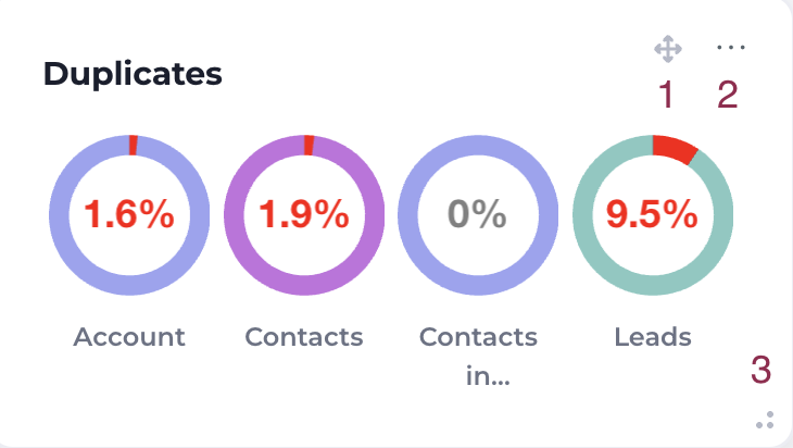
Hovering over a widget gives you the ability to:
- Move the widget to a different area of the screen
- Customize the component to analyze or view the history of a dataset
- Resize the widget to fit the desired screen area
Widget Components
Each widget displays a different parameter on the dashboard. Depending on the widget type, you can view a live summary of duplicates within a dataset, the history of deduplication performed by your DataGroomr instance, an organization-wide or object-level health scorecard, or the latest information about a release.
Org Scorecard and Object Scorecard
The Org Scorecard provides an organization-wide view of data quality health. The Object Scorecard focuses the same health view on a single Salesforce object. Configure each scorecard widget to target the org or a specific object.
Duplicates Summary
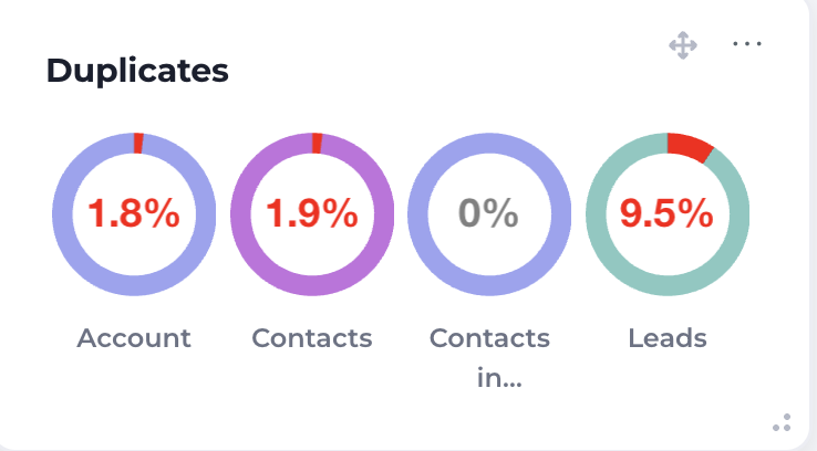
The Duplicates Summary component shows the live percentage view of duplicates within a Salesforce org. The larger the red portion of the ring, the higher the percentage of duplicates. Customizing the component changes the datasets being analyzed.
Duplicates History
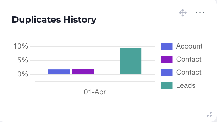
This component shows the historical data of duplicates within the datasets monitored by DataGroomr. The longer the bars, the more duplicates in the time period. Customizing the component allows you to change the overall timeframe being monitored, the datasets, and the timeframe of each bar.
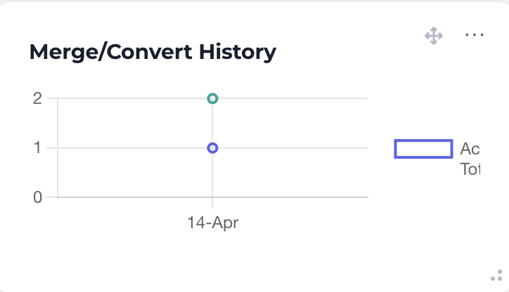
Merge/Convert History
This component shows the number of merge and conversion actions taken by DataGroomr over the specified time period. The higher the value, the more actions taken. Customizing this component allows you to choose the datasets being monitored, the time period, and whether to show a legend correlating each line to a dataset.
Data Quality Summary
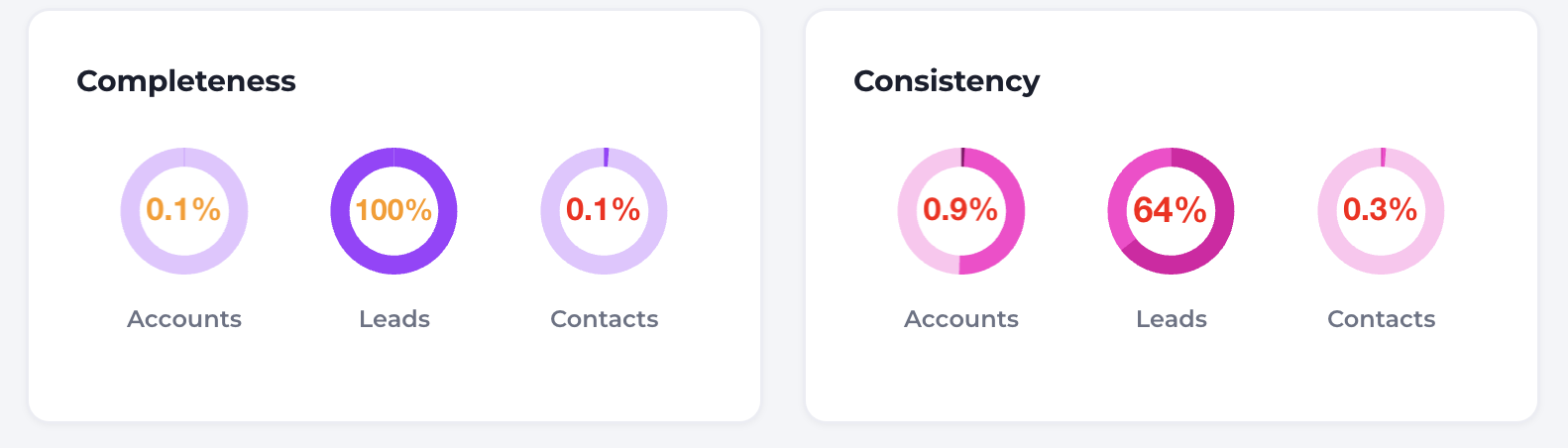
Similar to the Duplicates Summary, the Data Quality Summary shows the status of data quality in Salesforce as specified by your customized data quality models. Hovering over each ring shows the breakdown summary for each Cleanse (Brushr) dataset. Customizing the component lets you choose the dataset as well as the ordering of the data quality model displayed by the component.
Good to Know: The Reporting Dashboard is the home page of the app. The health views from the legacy Smart Dashboard are provided by the Org Scorecard and Object Scorecard widgets.